

DESIGN EDIT ISSUE 48 | DESIGN TOUR
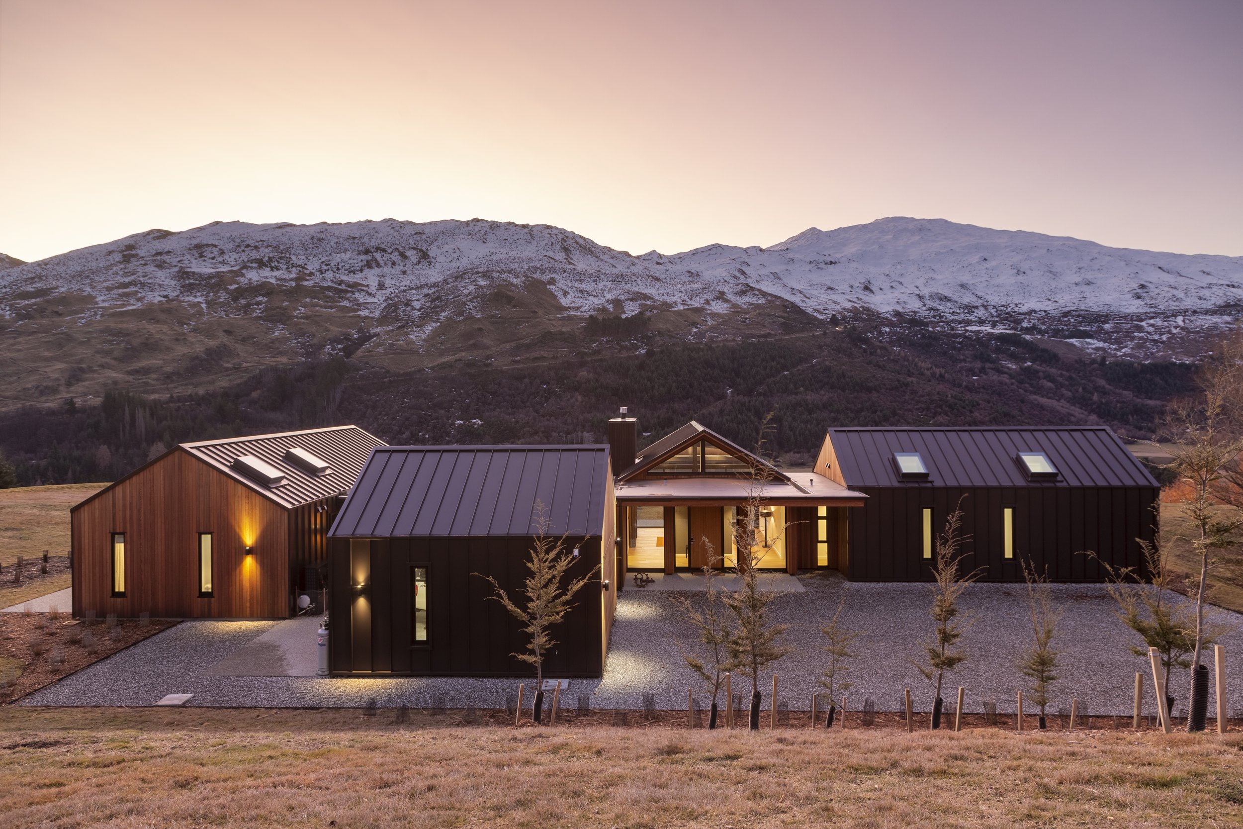
Sometimes Mother Nature knows best. The spectacular setting informed the brief for both the exterior and interior of this Queenstown holiday home. A visual connection to the mountains and landscape was key to creating a practical yet stunning home, at home in the mountain side setting.


THE BRIEF
The client’s brief was straightforward - this holiday home had to feel warm, welcoming and stylish. It needed to be practical to cater to adventure sport filled holidays, with timeless appeal that reflected the qualities of the region. But above all, the home had to relate to the spectacular landscape. They trusted us to bring their vision of “relaxed luxury” to life, in contrast to the “contemporary, minimal” aesthetic of their main home that we had been fortunate enough to work on with their clients.


INSPIRATION
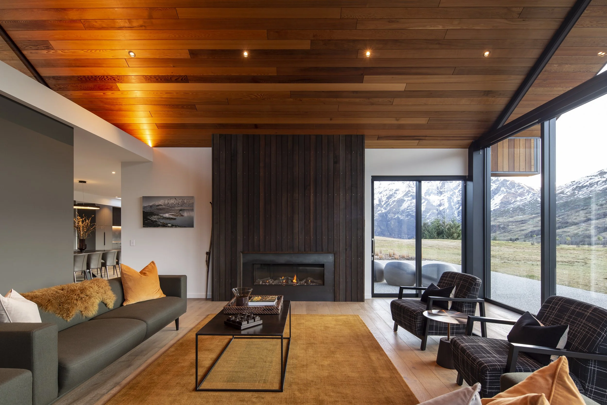
The wrap around views from this site are spectacular at any time of the year. Snow covered Coronet Peak provides the quintessential Queenstown vista, but it’s autumn where the colour palette is most vivid and most special. The burnt gold tussock, rich rust autumn leaves, lush evergreens and moody schist of the local environment were all echoed in the home. A strong and simple exterior materials palette of “Flaxpod” roof, joinery and cladding and rich cedar accents link the home to landscape. Oak flooring, cedar ceiling features and stone like tiling create an earthy, warm interior over which we’ve layered rich colours and textures with the furnishings.

““We enlisted Kirsten at the very beginning of the project and she brought to life the vision we had for our holiday home.
Her expert knowledge of building materials and impeccable taste ensured that making decisions for the out of town build was stress free.
And, in fact, the final result exceeded our expectations.” ”


COLLABORATORS
S3 Architects created a strong and simple form with interlinked gabled structures that blend into the towering hills and schist peaks. The tray roof wraps around the walls of the home, anchoring the home to the site. This solid form frames the high, vaulted ceilings and walls of glass framing the spellbinding views.


DESIGN DETAILS
The rich, autumn toned furnishing palette envelopes you, brining visual warmth to the rooms, creating rich and inviting spaces. We selected fabrics for their colour and texture. But they also had to feel soft, luxurious and comfortable, yet deliver the durability required in a holiday home. We love a challenge!
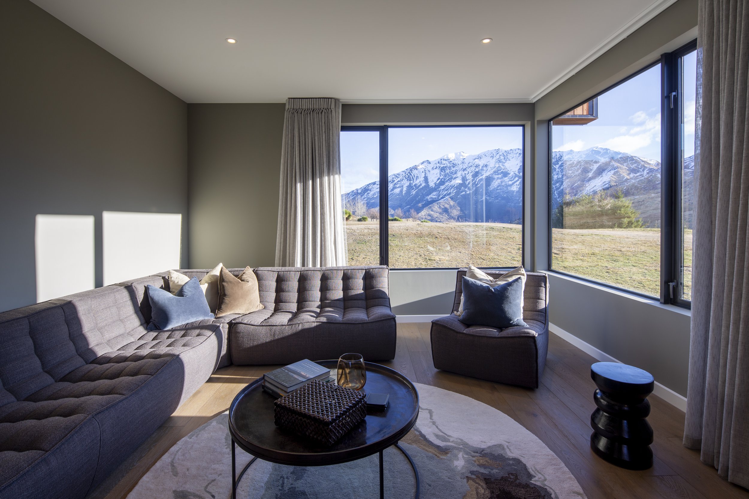
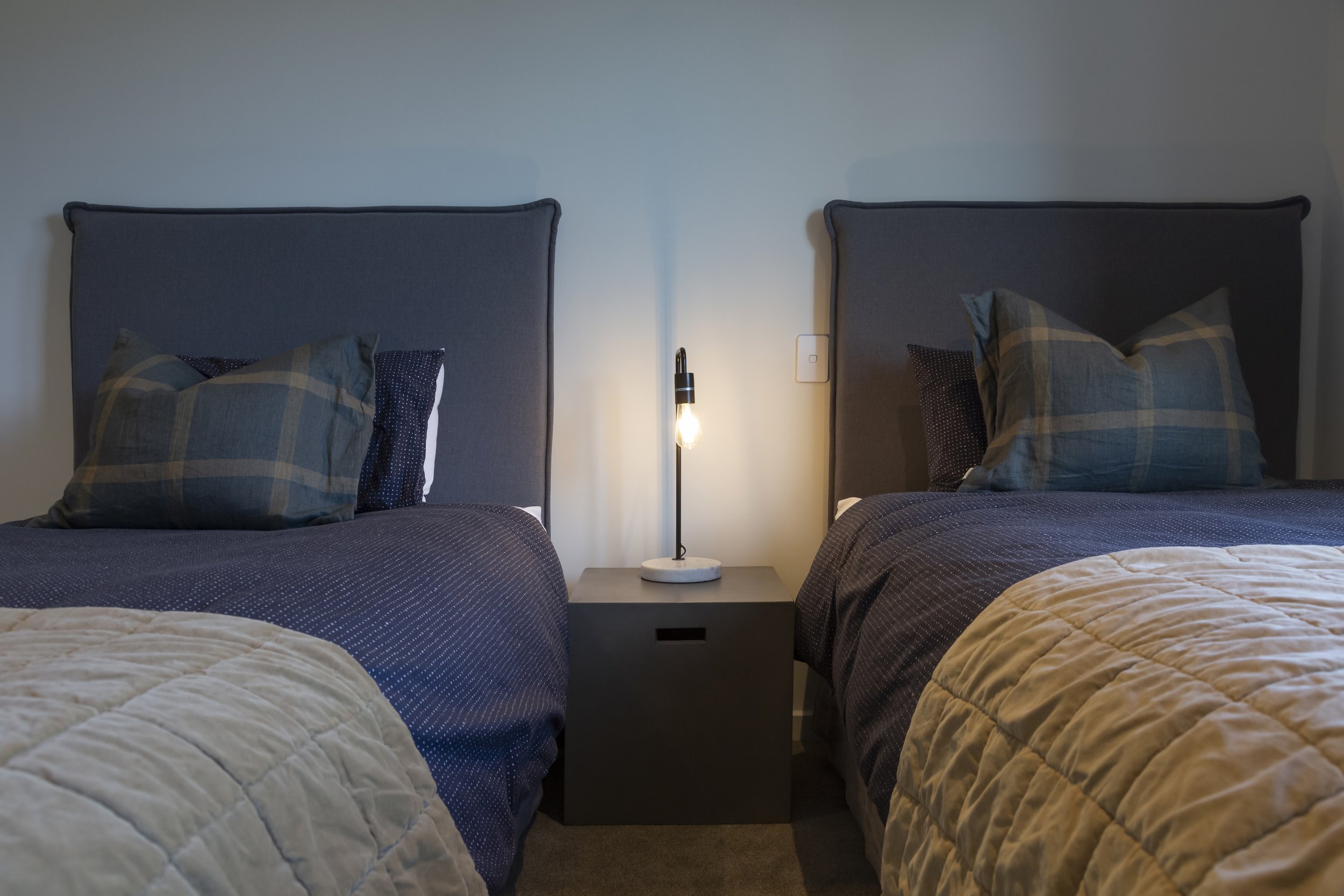
In the living room we selected furniture with streamlined, clean silhouettes - always mindful of not distracting from the view beyond. The long, lean sofa is upholstered in “Kea” green marled wool which is soft and gentle to touch, yet incredibly hard wearing. The solid timber chairs are covered in an equally practical black woven wool. Bedrooms were layered in slate blues and sage greens, again echoing nature’s lead.


INSIDE EDGE
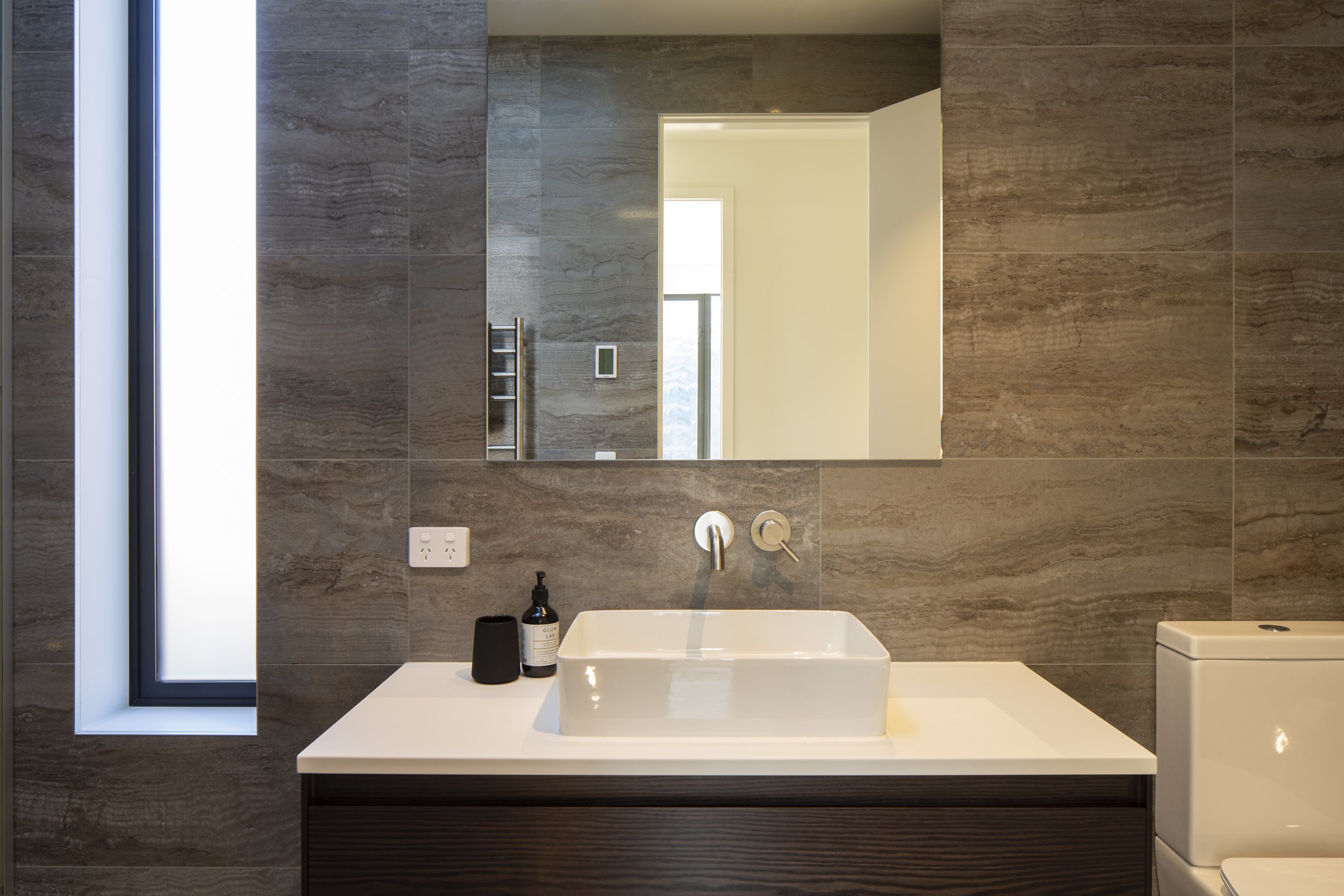
The earthy, natural palette extended to the kitchen, where a sprawling bench top in dark concrete-look stone is a practical work surface yet provides dramatic centrepiece. Schist like tones are echoed in the cabinetry, with hard wearing and anti scratch laminates. And the spectacular large format bathroom tiles always draw comment. We imported these from Italy especially for this client, their strong movement and warm tones echoing the form of natural stone, combined with the practical qualities of a porcelain tile.
THE RESULT
This home seems at one with the landscape - both the finishes and the furnishings connect visually to the spectacular mountainside setting. The earthy, rich and tactile materials combine to create a luxurious and comfortable holiday home, the perfect alpine escape to rest, recharge and relish all that is Queenstown.


COLLABORATORS
To read more of our recent blogs, click here.
